ONE SECOND (ZHANG YIMOU)
Cinematic Typography & Visual Narrative Identity
Top-Tier
100%
Cultural
Heritage. Direct collaboration with legendary director Zhang Yimou.
Bespoke. Custom-engineered logotype tailored for theatrical scale.
Resonance. Defining the visual soul of a "Love Letter to Cinema."
Overview
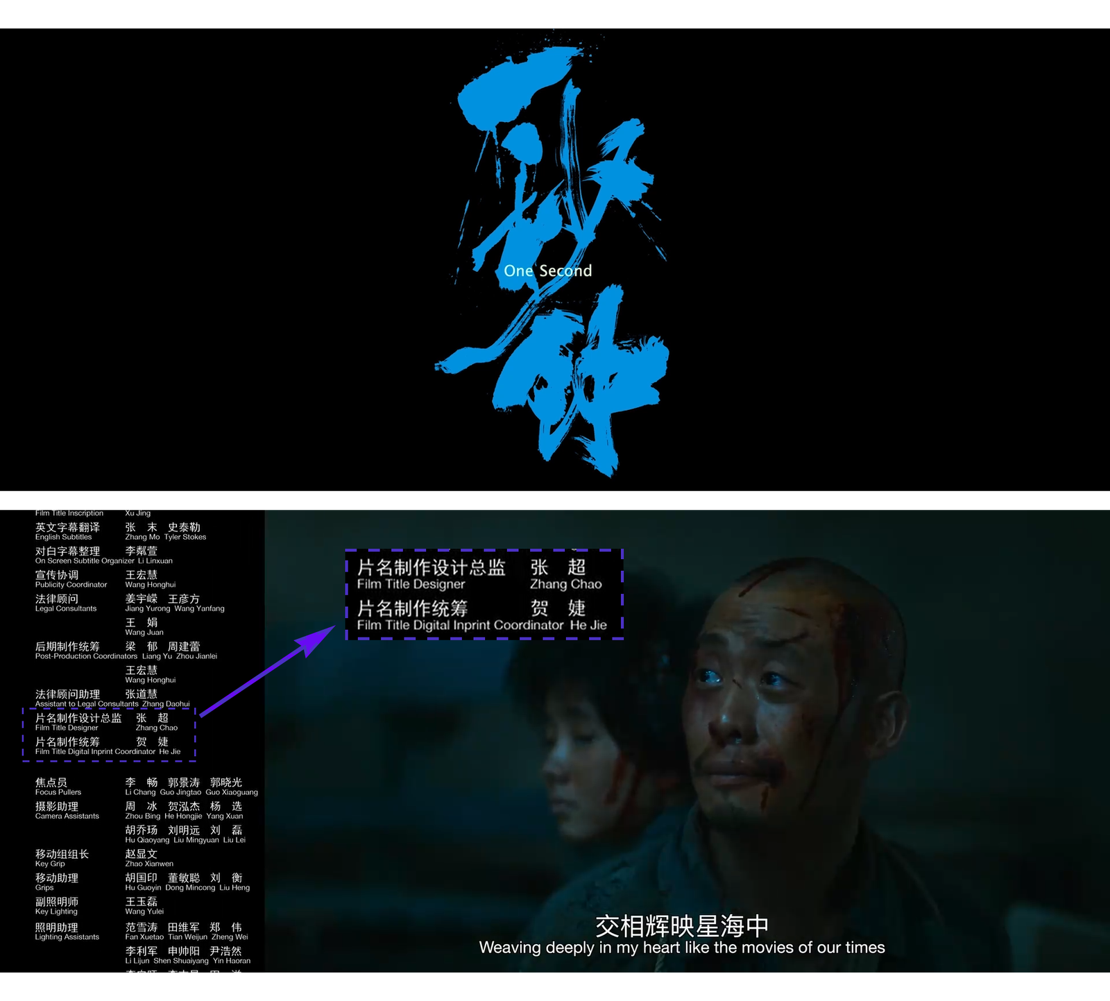
“One Second” is more than a feature film; it is legendary director Zhang Yimou’s profound homage to the era of physical film. Starring Zhang Yi and Liu Haocun, this period drama required a visual anchor that could carry the weight of nostalgia, grit, and the ephemeral nature of a single frame.
Our mission was to design and produce the Main Title Typography, creating a visual signature that functions as the audience’s first emotional entry point into this cinematic journey.
The Project DNA
Client: Zhang Yimou Studio
Sector: Feature Film / Period Drama / Global Cinema
Scope: Main Title Design / Logotype Architecture / Custom Font Production
Impact: Premiered as a definitive work of contemporary Chinese cinema, establishing a new benchmark for minimalist period aesthetics.


01 / The Challenge
Capturing the “Texture of Time.”
While modern cinema often leans toward polished digital perfection, “One Second” demanded the opposite. The challenge was to create a typeface that felt “born from the dust”—reflecting the 1970s setting and the tactile, grainy reality of celluloid film.
The identity had to balance:
Historical Weight: The ruggedness of the Gobi Desert and the era’s austerity.
Poetic Fragility: The “one second” moment where light meets the screen.
02 / The Strategy
The “Ink & Celluloid” Approach.
We treated the characters not as static text, but as a Cinematic Artifact.
Structural Narrative: We deconstructed traditional stroke weights to mimic the uneven absorption of ink on paper and the flickering light of a projector.
Visual Gravity: By optimizing the spatial balance of the characters, we ensured the title commanded the screen, providing a sense of “prestige stability” even in a minimalist composition.
03 / The Craft
Custom Font Engineering & Logotype Mastery.
04 / The Result
An Icon of Contemporary Realism.
The finalized title design has become inseparable from the film’s identity. It successfully bridged the gap between historical realism and high-end cinematic branding, proving that even a single font can encapsulate the soul of a two-hour masterpiece.